
.svg)
.svg)
.svg)
Case Study
Leading end-to-end design of a native mobile app
Research, prototyping, and testing of Edquity's native mobile app
Project Overview
Team: Lead engineer, visual designer
My Responsibilities: End-to-end design process spanning research, problem definition, solution exploration, ideation, rapid prototyping and testing, brand/visual identity
Timeline: June - September 2018
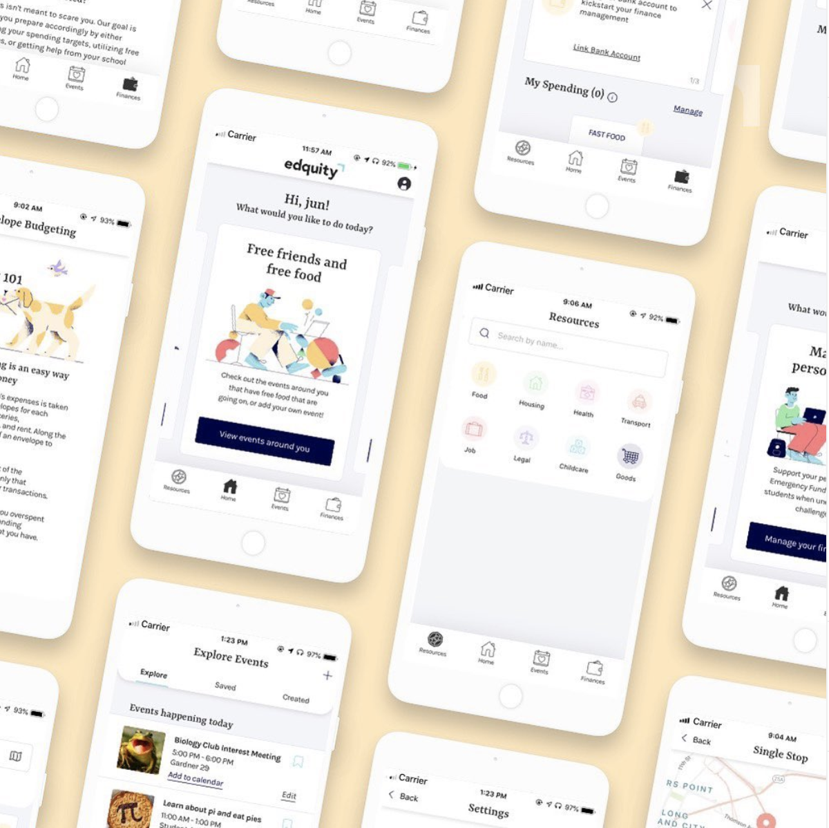
The case study is an exploration on how low-income college students might be able to easily access a centralized emergency resource database and connect with support during an emergency. Over the course of four months, I spearheaded the user research and design of our native mobile app as the sole designer on the team. Through a mix of user interviews, prototyping and testing, my goal was to take a broad, conceptual idea and deliver something valuable to our users while creating a stable foundation for iterative development. Since launching the MVP in November 2018, the Edquity app has evolved into the best-in-class emergency support product with 350,000+ active users.
In the context of this case study, a ‘resource’ is defined as a free or reduced cost emergency support available for low-income individuals with food, housing, health care, and other challenges. These range from physical establishments like food pantries to digital housing vouchers to subsidized child care.
Background
Edquity is a technology provider that helps colleges improve students’ basic needs and financial security by increasing access to emergency resources and funding. To help students, including the 3 million who drop out every year due to a time-sensitive financial crisis of less than $500, Edquity provides partner colleges with a white-labeled mobile app and web platform where students can apply for emergency cash grants, discover emergency resources, receive personalized financial management, and more. I joined Edquity in 2017 as the first design hire and led our early research and design work as the sole designer on the team.
Research and Discovery
I spent two weeks learning more about our users, the problem space, and the higher education landscape through user interviews and secondary research. Digging into the findings, we synthesized three main problems:
- Fragmented information landscape: Most colleges don’t have a centralized resource repository. For the handful of schools that did, there was no one tasked with maintaining it. This resulted in static resource repositories buried in the depths of the college’s website filled with outdated resources and not actually helpful for students
- Stigma associated with basic needs: There is still a tremendous societal stigma tied to basic needs insecurity. Hungry students told us they didn’t want to go to the on-campus food pantry out of fear that they would be seen by peers and labeled as “poor”
- Lack of centralization and disparate data sources: Student supports (basic needs initiatives, student services and organizations, financial aid) aren’t a part of an integrated system and therefore not easily accessible to students. Communication between the various offices is fragmented and administrator’s feed and pull information from disparate data sources. This precludes them from developing a holistic, accurate picture of student needs
Our research yielded three critical insights:

Opportunity
To jumpstart creativity during our kickoff, I led stakeholders (CEO, CTO, PM) through a “How Might We” (HMW) exercise from GV Ventures’ Design Sprint framework. This is one of my favorite collaborative activities to run prior to ideation to help familiarize participants with the problem space and transform problems into areas for solution exploration.
[How might we] Make the patchwork of social services easier to navigate by centralizing information
[How might we] Make a friction-filled resource discovery process more visual and individualized
[How might we] Reduce the friction in connecting with resources
In the ideation sessions that followed, we generated a wide range of ideas. Various stakeholders had different ideas about concepts and how we would get our users to engage with it. Ideas ranged from community-oriented concepts like building virtual support networks to action-oriented ones like making a location-based digital emergency plan.
The emphasis on the need for visualization and individualization were clear themes that ran through the ideas

I explored it all, varying in depth from whiteboard sketches to lo-fi prototypes. After countless explorations, numerous rounds of feedback from stakeholders and students, and updated estimates from the engineering team, we finally settled on an MVP direction. We prioritized a few key features that would be most valuable and feasible.
Final Solution
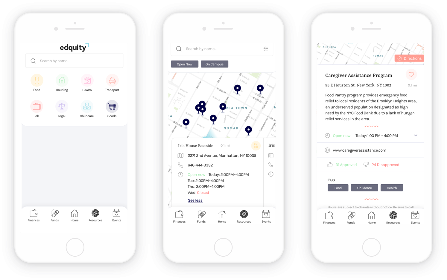
Find financial assistance, food pantries, medical care, and other free or reduced-cost help in your area, anywhere in the US. Help is just a tap away.
A visualized experience
The visual resource-mapping feature, or map view, is an exploration of what a visualization of resource availability and proximity could look like and mean to our users. We integrated with Aunt Bertha, a leading referral network for social services in America, to expand our resource database to include 311 resources. Their API aggregates localized resources across every ZIP code in the nation.

An individualized experience
The list view is the intuitive front-end for our comprehensive resource database. It features a set of powerful tools for sorting, searching, and filtering. One thing that our users let us know in each interview is that (their approach to) finding resources is not one-size-fits-all — it’s highly varied, individualized, and often nonlinear. For example, one user may be willing to travel further for a food pantry that’s open later. But for another user, proximity may be the deciding factor. It was important to design for this freedom and flexibility. Users can tweak parameters based on their individual and control the quality of results that are returned.

An action-oriented experience
The resource detail page is designed to motivate the user to take action. All the granular, resource-level information and key user actions (calling, going to the website, getting directions) live here. We integrated with the Google/Apple maps API to create a seamless mapping experience.

A personalized experience
We designed a short questionnaire to provide personalized recommendations. Users answer 5-7 questions and get personalized recommendations for resources that may best serve their needs. We also support real-time, location-based nudges. Between school, work, extracurriculars, and family obligations, our users have enough on their plates. Using our Notification Manager, they can set up a custom alert schedule to get notified when they're close to food resources during meal time.

How We Got There
Two types of users
Early on we identified two types of users, distinct in nature because of their differing needs/goals and degrees of savviness and experience.

From user research, we know that a majority of our users are Yelp "power users" which led us to explore Yelp’s filter bar as well as sites with robust search experiences and result page interfaces such as Amazon, Google Maps, etc. I didn’t want to reinvent the wheel, our goal was to make the experience feel familiar and learnable. I synthesized the data from the observed search/filter patterns and started white-boarding different layouts and UI controls.

After hashing out ideas and flows on paper and whiteboard sketches, I began designing variations in Sketch and quickly spinning up prototypes. I would show my team the designs I was most confident about, then get feedback and go back to the drawing board for another iteration on the designs.

Every single detail was nuanced, and I felt as if I was trying to put all these important pieces together into a jigsaw puzzle.
Concept Testing
Before finalizing the visual details of the design, I wanted to see how our users responded to our chosen direction. Because our proposed feature set wasn’t meant to solve an inherent user “need,” we conducted a concept test rather than a usability study. Our goal was not to see if our users could complete a set task as quickly as possible, but rather to gauge general interest and intrigue in the feature, and to figure out which parts they found the most value in given various scenarios. The map interface has more information visible, while the list interface abstracts away more information, providing a simpler interface.


Findings

While the list view emerged as the overall winner, with a larger overall percentage of participants indicating that it was easier and sufficient to use the list interface in the given scenarios, participants responded positively to the map view. The list was made the default view, with the option to toggle to the map.
Iterations
Map View — I tested the views across rural/metropolitan settings with varying levels of resource density (number of resources within a 2-mile radius). I discovered that in metropolitan areas (like New York City) where resources are more densely populated in smaller geographic areas, the map view quickly became an overwhelming experience. I made design decisions to ensure the experience was standardized across device types and geographic location.

- Responsive resizing of pins to accommodate various device sizes
- Limiting the number of pins displayed at once based on resource density in the given geographic radius
Filtering/Sorting Logic — We didn’t have the critical mass of data needed to build a rating system to support "sort by rating" functionality. So in the MVP we supported sort by distance and filter by: resource category, on-campus/off-campus, open now.
UI and Information Architecture
Once we'd identified the top-level information to surface in each of the views, the next challenge was creating a consistent structure and hierarchy despite varying levels of information density across each of the main screens. For example, the resource detail screen (designed for depth) is far more information-dense than the list view screen (designed for breadth). After several rounds of feedback, I began working with our front-end developer to review the UIs and interactions of individual elements, like hovers, clicks and empty states.

I experimented with dividers, white space, and subheaders to organize information and create distinct visual separation between content areas. I needed to establish a rhythm and hierarchy on the page without creating visual noise. I was concerned that sole use of dividers would lead to visual noise and dilute their impact, so I ultimately settled on a combination of dividers and white space. Icons were used as anchoring elements on the left-hand side of the section and to provide supplemental visual cues, and break up the text-heaviness of the screen.
I was torn between making the primary action on the resource detail page direct users to the website or call the resource. During testing, most participants stated their preference would be to call the resource, so the CTA is to call.
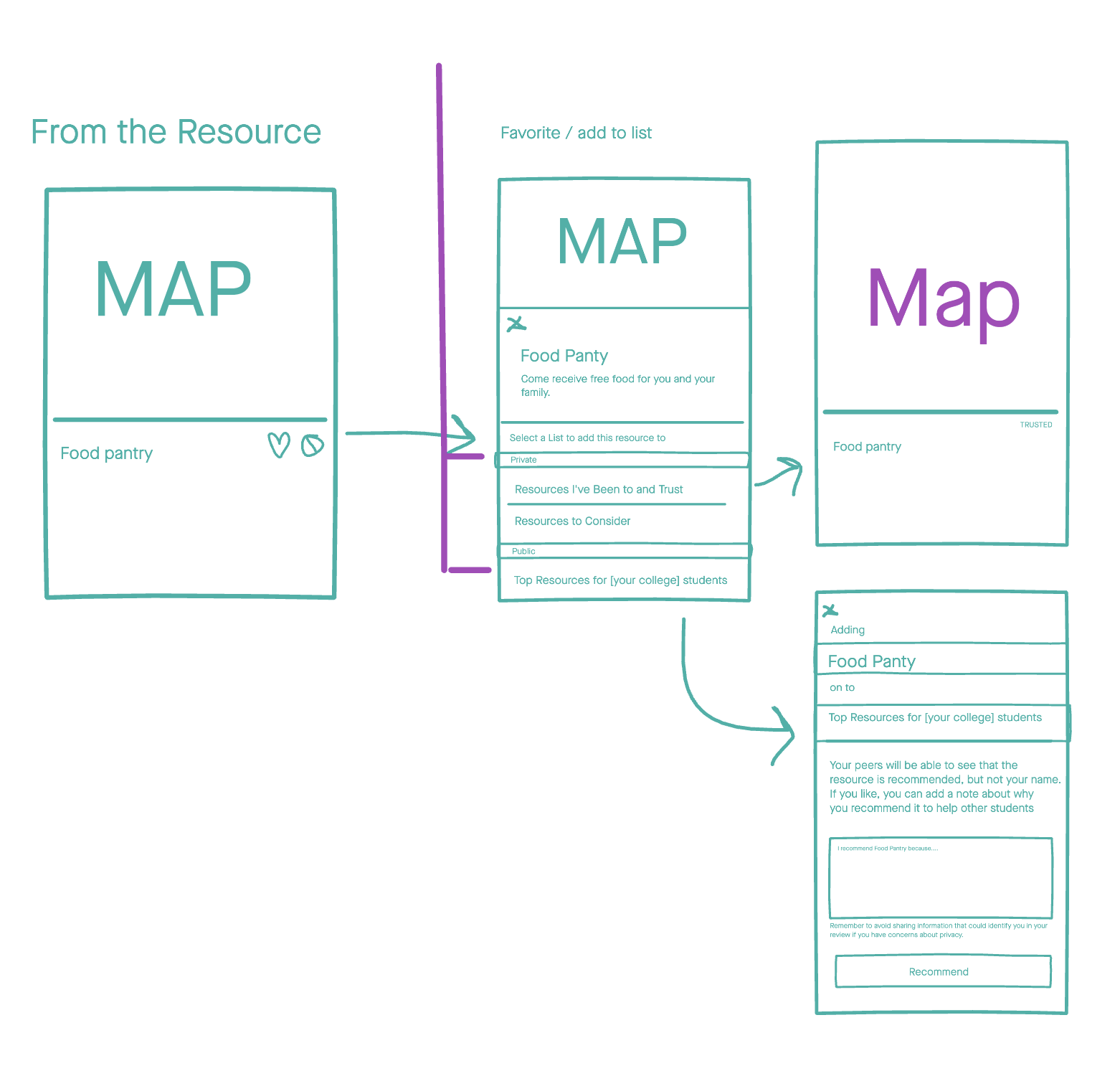
Introducing Cards
I introduced cards as the main UI element to give structure to the content and act as containers for different information levels. and chunking of information. In introducing a new core element, I also created general usage guidelines to help designers implement cards effectively.
General usage guidelines created cohesion, order, and meaning for the use of cards and allowed for intelligent and consistent organization and usage.

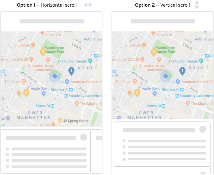
Introducing Carousel Navigation
In the map view, I explored a horizontal scroll (which was slightly unconventional) and a vertical scroll that was more aligned with interaction patterns in Google Maps, etc. However, when testing with users we discovered that users used the map view to make decisions based on distance and relative location. The vertical scroll obscured the map view, so we went with the horizontal scroll.
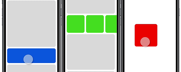
I explored a carousel pattern for the cards on the map view but I was concerned that the horizontal-scrolling interface was slightly unconventional and would pose usability issues for our users. We tested it and found that users actually liked the carousel view because they were able to concentrate their attention on only one or two resources at a time, in contrast to the list view. We ended up re-using the carousel pattern across the app.
Technical Limitations
After validating our direction, there were still a lot of details I had to finalize before our team of engineers started building out our pilot version of the feature. We uncovered two major limitations. First, the API database we were pulling from was huge, so in order to optimize for load times we had to limit the number of resources displayed on the screen at once. More resources = more API calls = longer load times.
To solve this we added a “load more” button on the front-end to trigger lazy-loading on the back-end. So in the list view, we return five resources and if the user scrolls to the bottom they can press the “load more” button and the next five are loaded.
The second limitation we did not have enough engineering bandwidth or time to build the robust search experience, so it was scrapped entirely and prioritized in the product backlog for iterative rollout. This was a massive blow to the experience as ‘search’ was a critical part of the discovery process. But ultimately it meant we could spend more time refining the search experience through the interface, taxonomy and algorithm improvements prior to going into production. In the MVP, users could select a top-level category and filter by category. As suspected, this was a major hindrance to the user experience and I pushed for this functionality to be implemented in a subsequent iteration.
Brand & Visual Identity
As the product evolved, so did our visual style. When we launched in 2018, our priority was to use insights from students, practitioners, and researchers to create several high-functioning products that meet the financial needs of our users. And while Edquity’s technology quickly improved with each interview, we were less diligent in applying what we learned to our visual identity, including its meaning and what it communicated to students. I worked closely with our visual designer to craft a new visual identity that better captured the empathy and care at the center of our work.
We learned early on that many students, often out of necessity, are financially savvy and determinedly resourceful. Since Edquity is helping students tackle issues that are extremely sensitive and stress-inducing, we wanted to strike a tone of empathy, understanding, and mentorship. Our users needed caring advice from someone who’s experienced what they’re going through and can ultimately help them become financially secure and stay in school. We sought to build a brand that mirrored an older sibling — someone who demonstrates care and kindness when times are tough, and is always there to help.
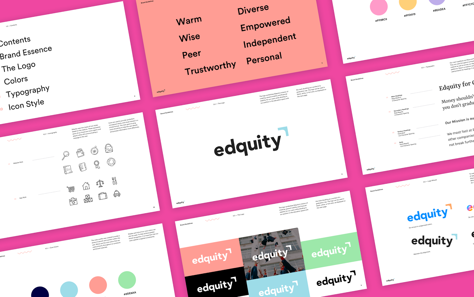
Brand attributes that captured this “older sibling” tone, along with traits that reflect the fiercely resilient students we serve: warm, diverse, wise, empowering, trustworthy, personal, and independent. I partnered with our Visual Designer to create a ‘Design Brief’ that captured guiding product principles, the product’s personality, tone and voice, color considerations, and other branding considerations.
Introducing, the Edquity Rebrand!
Post-Launch
Product Evolution: MVP - today
Edquity has gone through a couple of major iterations from the 2018 MVP launch to today. After launching, we focused on identifying and building out a more robust set of emergency resource features. We conducted generative research sessions and used the insights to create scrappy sacrificial concepts to solicit feedback, and eventually ran full-on (remote) co-design sessions with students. After month of prototyping, testing, and iterating, we rolled out a set of features geared towards sharing and curation of resources.
Though we saw spikes in short-term user activity, there were still concerns about long-term engagement and product ‘stickiness’. When students encountered emergency expenses (unexpected car repairs, medical expenses, etc), the emergency resources were inadequate. Students needed cash. Through market research and conversations with customers, we identified a space that was ripe for digital innovation: emergency cash assistance. In the past two years, the product has evolved into a comprehensive, emergency capacity-building product.
Learnings
This project was a huge endeavor, and the amount of time and resources that went into designing it was unlike anything I, or even my team, had been used to. Here are a few important lessons from working as the only designer on this project:
B2B2C products pose a unique set of challenges + constraints: With B2B2C products there can be delta between the Customer’s (the College) understanding of End User (students) needs and their actual needs. In the pilot app, we overly relied on the college’s assessment of student need with the assumption that once they purchased the product and pushed it to students via their various distribution channels, people would use it. This wasn’t the case. Through app analytics and user interviews we were able to understand where we were missing the mark and identify iterative improvements and additional features/functionality to deliver discrete units of value to our End Users. By re-orienting our product/design roadmaps around user needs, we increased End User engagement, and as a result, create value for the Customer through analytics. We rolled out a suite of analytic tools, including a comprehensive dashboard, in early 2020.
Prioritize progress over perfection: We invested a lot of time in upfront generative research. The tradeoff was that it took months before we put sacrificial concepts in front of users, which actually yielded more actionable insights than conversations about theoretical concepts. If I could do things differently, I would build in more time to prototype concepts and put them in front of users. I would also include users in our feature brainstorming sessions (before we’ve mocked up concepts) for a more collaborative, co-design approach in the opportunity identification phase.
Get engineering involved early on: We struggled to foster a cross-functional understanding of user needs and pain points. We wanted to experiment with getting technical stakeholders involved earlier on in the design process, so we introduced a requirement that every engineer to sit in on at least one research session per quarter as a note-taker. The result? We found that when we involved our engineers in the research process versus roping them in after the fact, and actively socialized our user personas across the engineering function, we were able to streamline handoffs and develop a better cross-functional understanding of the relationship between technical decisions and user implications. As our engineering function grew we changed the requirement from once per quarter to once every three quarters.


.svg)